Text Analysis
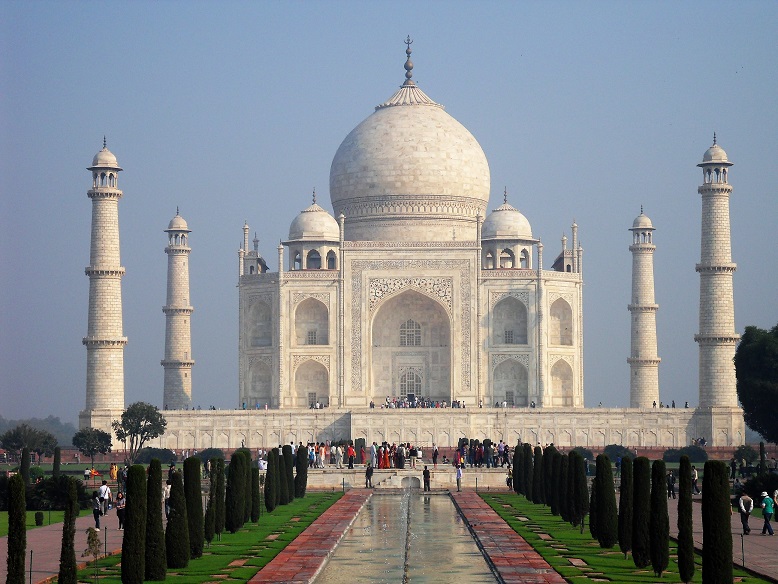
The title itself is rather suggestive because the purple image kind of looks like a shilouette of the Taj mahal:
This brings some suggestions to mind that this film may be about something Asian orientated. It also related and looks like the way the hindi write the font is similar although i'm not saying its identical
See the
way the "d" bends in both the example and the Title? Even the
way the "i" is dotted. I seem to like the colour scheme too as
the colours do compliment the title itself and may connote something. For
example the purple is a dark colour and from the center of the image its lighter.
The middle could connote the equilibrium; meaning not everything was good in
the beginning however that’s just the way things were. In other words it wasn't
necessarily a positive equilibrium. As the purple gets darker, this suggests
that disruption kicks in. The gold could be the silver lining of the situation
that there was something that made the dark times much better and something
good happened.
The
"A" In the Title is stylized to look similar to that of a lamp.
The first
thing we would acknowledge is the colour of the Title, which is green. This is
a very explicit connotation that green has a part to do with the movie or
contributes to a wider aspect of the movie. Along the similar lines of the
colour, the "S" has antenna-like ears, which suggest that the
character or something about the movie has these features. However if we
linking it to the colour then something about monsters being a key theme is
more plausible.
I also
noticed that All the Letters are in capitals except for the E. Now I’m just
going to link this to the analysis i made on the previous paragraph. The title
in general suggests that this monster is tough and big, has a hard-shell on but
then lower-case e suggests that he’s just like everyone else and the monster
like creature isn't a monster inside and an be quite pleasant.
More
about the colour he green at the bottom of the title is dark and the top is
lighter. This may mean that the beginning equilibrium he was acknowledged more
as a monster and as the film progressed, he was acknowledged as a normal person
despite his physical appearance and the ears at the top where the light green
is symbolizes that he no longer has to hide and he feels comfortable around the
people that has accepted him. These analyses are based on someone who may not
have seen the film.
I get a futuristic feel from this and as always im
looking at this from someone who hasn't seen Tron. By just the title i can tell
it has something to do with technology because of the blue neon lights and the
way the font is laid out. Also this particular blue neon lighting reminds me of
the bike grid game where the objective of the game is to trap your opponent in
your light leavings. This is from the original Tron sequence however this
particular Tron sport is very popular among people and most people have bound
to see it some stage in their life.
It doesn't give a lot away as it start rather abstract in its design and not much can be connoted off of it. Neon lights are also supposed to make people feel happy and from someone else's perspective they could think that this film is based off of thrill and adventure because these are genre we can relate to "Happy".


No comments:
Post a Comment